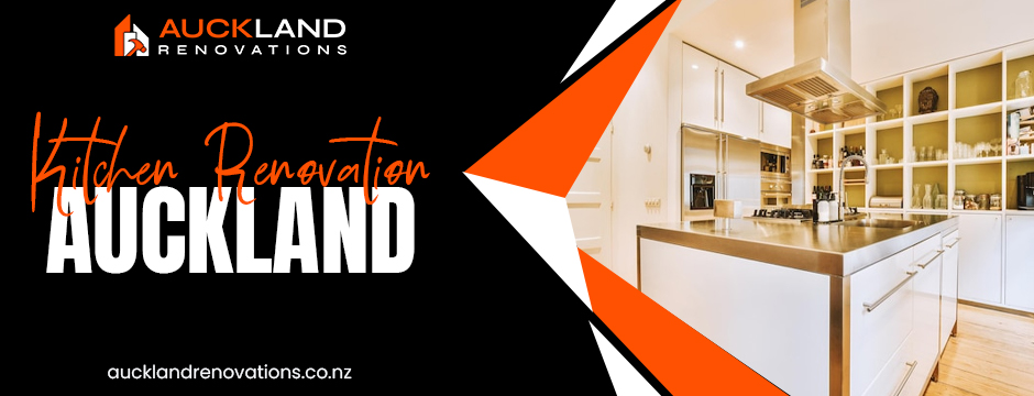
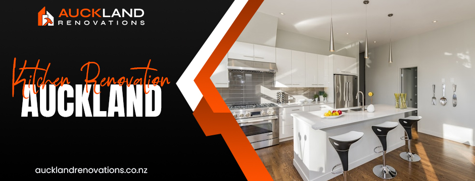
If you’ve ever stepped into a kitchen and felt instantly calm, energised, or even hungry, chances are it wasn’t just the food on the counter that shaped your mood. Colour has an incredible way of influencing how we feel, and in kitchen design, it’s one of the most powerful tools a homeowner can use.
For anyone planning a kitchen renovation in Auckland, understanding how colours work on a psychological level can mean the difference between a space that feels flat and one that feels alive. At Auckland Renovations, we’ve seen homeowners fall in love with their kitchens again simply because they chose the right shade for their walls, cabinets, or splashback.
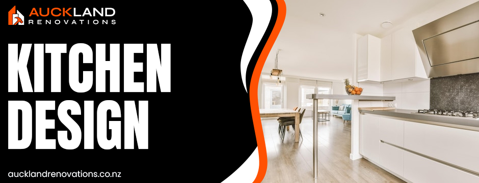
Why Colour Matters in Kitchen Design
The kitchen isn’t just where meals are prepared. In Auckland homes, it often doubles as the social hub — a place where family gathers in the mornings and friends linger with a glass of wine in the evenings. Colours set the tone for these moments. They influence appetite, energy, and even how spacious or cosy a room feels.
Think of it this way: white walls can make a Grey Lynn apartment feel open and fresh, while warm yellows might give a family kitchen in West Auckland a lively, welcoming buzz. Choosing the wrong palette, on the other hand, can leave a space looking clinical or disconnected from the rest of the home.
White: Clean, Bright, and Always Popular
It’s no surprise that white remains a favourite in kitchen renovation in Auckland. A white kitchen feels light, crisp, and timeless. It works beautifully in apartments where space is limited, creating the illusion of openness.
But colour psychology reminds us that too much white can feel a little sterile. That’s why designers often pair it with soft greys, warm wood tones, or brass hardware to add depth and personality.
Blue: A Fresh Coastal Feel
Auckland is surrounded by water, and many homeowners lean toward shades of blue to capture that coastal calm. Pale blues make smaller kitchens feel airy, while navy adds drama and sophistication.
Blue also carries a subtle psychological twist: it’s known to reduce appetite, which can be appealing for households that prefer a balanced, wellness-focused lifestyle. It’s a colour that keeps kitchens feeling calm, clean, and uncluttered.
Green: Nature Inside the Kitchen
Green has a special resonance in New Zealand homes. With our bush tracks, rolling hills, and love of the outdoors, it’s no wonder Aucklanders are choosing green more often. From sage cabinets to bold emerald walls, green brings freshness and balance to the kitchen.
Psychologically, green is a calming colour that connects us to nature. It works especially well with natural finishes — think stone benchtops, timber floors, or rattan accents. For homeowners who value eco-friendly living, green isn’t just stylish, it’s symbolic.
Grey: Modern and Versatile
Grey has become the go-to neutral in modern kitchen design. It’s adaptable, works with almost any accent, and creates a sleek, urban look that resonates with Auckland’s mix of heritage and contemporary homes.
Light greys are perfect for open-plan layouts, providing a smooth backdrop that lets other features stand out. Darker shades bring a touch of sophistication, though they need careful balancing with warm lighting or textured finishes to avoid looking flat.
Yellow: A Burst of Energy
Few colours can lift the mood of a room like yellow. Even on a dreary winter morning, a yellow splashback or set of bar stools can bring sunshine indoors.
Psychologists suggest that yellow stimulates appetite and conversation, making it an excellent choice for busy family kitchens. Too much, however, can overwhelm the senses, so it works best as an accent rather than a dominant shade.
Black: Bold and Contemporary
Black kitchens are becoming a statement feature in high-end Auckland homes. When paired with marble benchtops, matte cabinetry, or metallic fixtures, black oozes sophistication.
It’s a colour that demands confidence, but when used well, it can make a kitchen feel both luxurious and grounded. Black works particularly well in open, light-filled homes where it doesn’t dominate the space.
Red and Orange: Appetite and Warmth
Red and orange are known for stimulating appetite and conversation. While they might feel too bold for entire kitchens, they shine as accent colours. A terracotta feature wall or burnt-orange pendant lights can create a sense of warmth and energy without overwhelming the room.
These colours are often chosen in homes designed for entertaining, where the kitchen is central to social gatherings.
Matching Colour to Lifestyle in Auckland
Every Auckland home has its own character, and the best kitchen designs reflect that. In smaller city apartments, light tones such as whites, soft greys, or pale blues keep things open and bright. In larger suburban homes, warm greens or yellows create an inviting family hub.
At Auckland Renovations, we often encourage homeowners to think not just about style trends but also about how they live day to day. Do you want a calming space for quiet mornings, or a lively hub where everyone gathers? The answer will help guide your palette.
Colours That Add Value
Colour choices can even affect property value. Neutral, timeless palettes like white, grey, and soft green appeal to a wide market, making them a safe investment. Bold choices like black or red can add personality, though they may not suit every buyer.
For homeowners planning to sell, it pays to keep colours versatile. For those creating a forever home, the focus should be on personality and lifestyle fit.
Why Choose Auckland Renovations
At Auckland Renovations, we don’t see colour as just another decision on the checklist. It’s the element that ties everything together. Our team specialises in helping homeowners select palettes that complement architecture, lighting, and lifestyle while ensuring your investment adds value to your property.
From concept to completion, we guide you through choices that make sense not only visually but also psychologically. The result is a kitchen that looks stunning, feels right, and works for you every single day.
Conclusion
Colour psychology is more than design theory — it’s a practical tool that helps Auckland homeowners create kitchens that truly work for them. Whether you’re drawn to the calm of blue, the freshness of green, the boldness of black, or the warmth of yellow, your choices shape the atmosphere of your home.
If you’re ready to start your kitchen renovation in Auckland, talk to the team at Auckland Renovations. We’ll help you choose colours that not only look beautiful but also enhance the way you live.
FAQs
- How does colour psychology influence kitchen design?
It affects mood, appetite, and how spacious or cosy a kitchen feels. The right palette creates both style and functionality.
- What are the most popular kitchen colours in Auckland right now?
White, grey, and soft green remain strong favourites, while navy and matte black are gaining popularity.
- Can colour affect the resale value of my home?
Yes. Neutral colours often appeal to more buyers, making them a safe choice for increasing value.
- What colours make a small kitchen feel bigger?
Light tones such as white, pale grey, and soft blues open up a space and reflect more light.
- How do I choose a colour that fits my lifestyle?
Think about how you use the space. Families may enjoy warm, energising tones, while entertainers often prefer bold, dramatic palettes.